CLIENTS
Stellan Partners
TYPE
Branding
AGENCY
Vanksen
ROLE
Creative Direction
Art Direction
Branding
Complete rebranding for Stellan Partners, a Luxembourg-based law firm: naming, logo design, visual identity and digital assets.
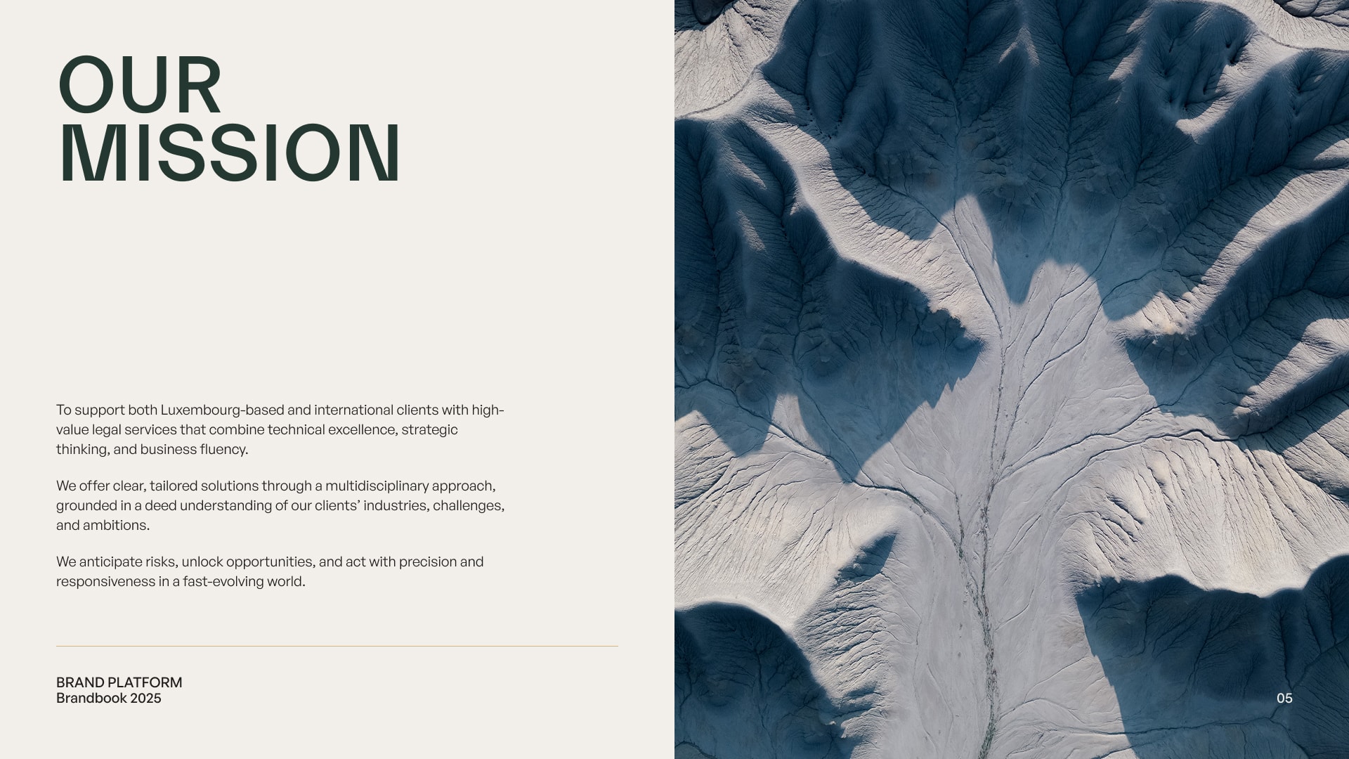
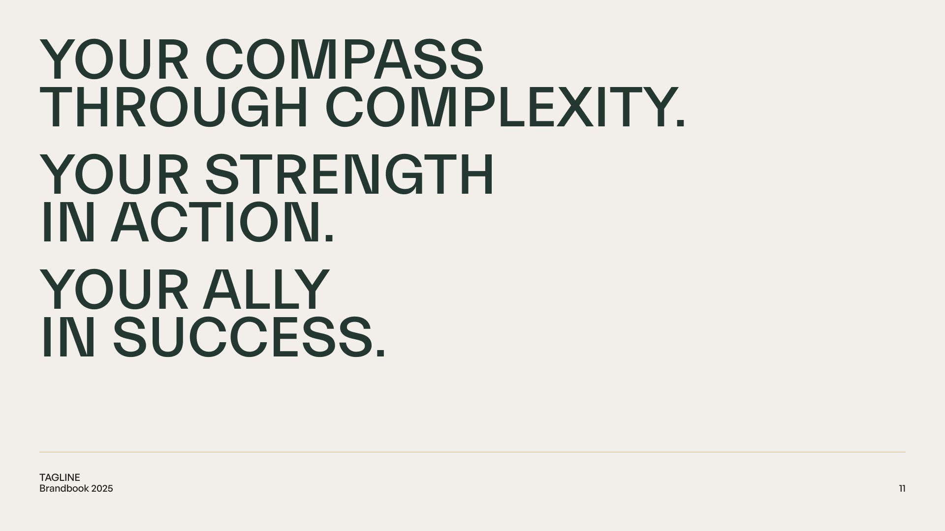
A timeless identity shaped by clarity, structure and strategic depth.

About the Rebranding
Following its separation from the PwC network, the Luxembourg-based law firm needed more than just a new name, it needed a complete repositioning.
The challenge was to design a brand that could stand on its own: credible, international, and future-facing.
The rebranding was not only about visual change, but about defining a new identity aligned with the firm’s ambition, values, and tone of voice.
Stellan Partners was born from this strategic shift, a name and identity built to convey trust, expertise, and clarity in a demanding legal environment.
Creative Direction
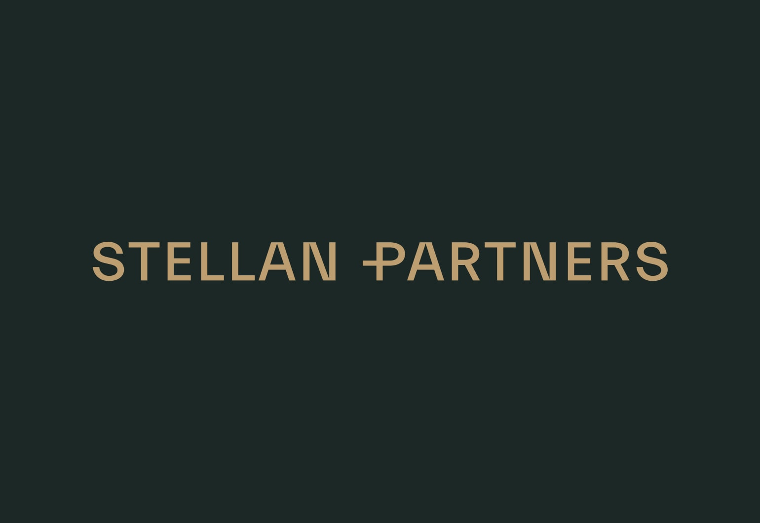
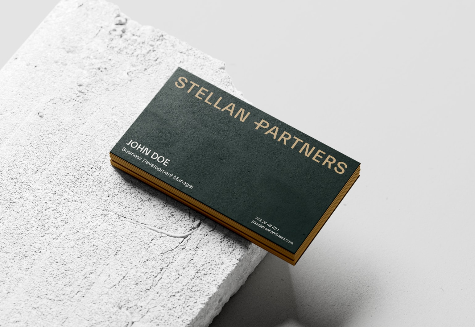
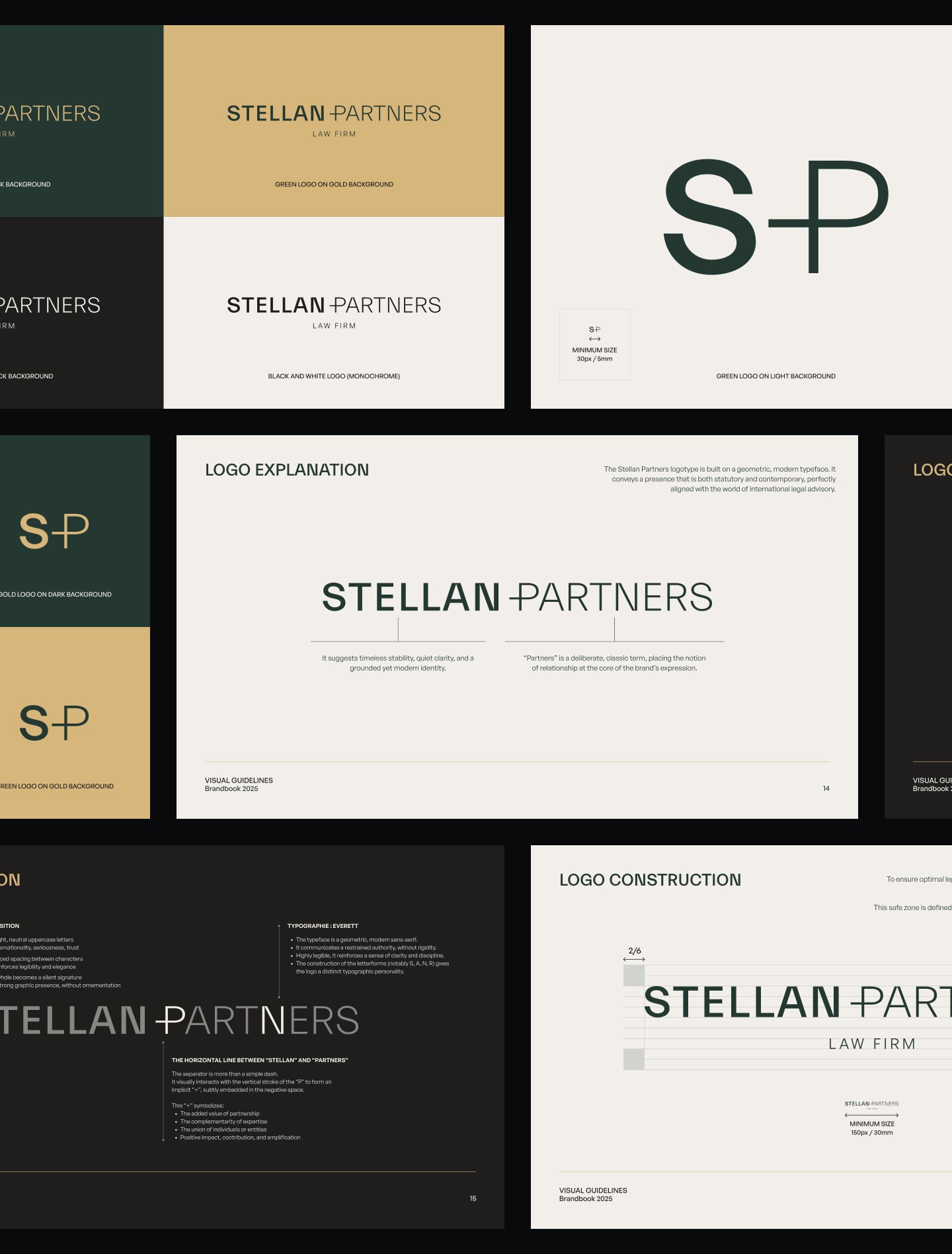
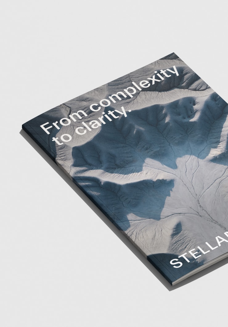
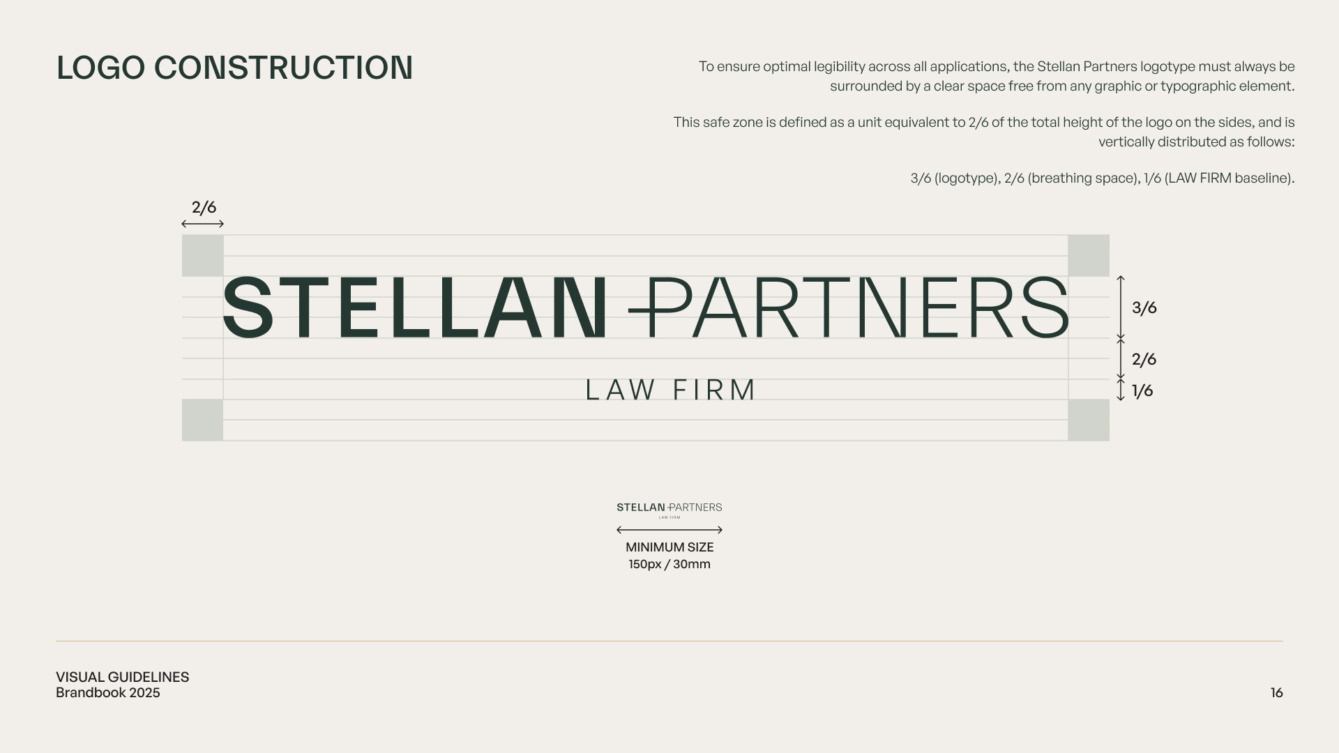
The logotype is purely typographic, built around geometric uppercase letters that convey calm authority and precision.
The horizontal dash visually aligns with the “P” stem to form a subtle, embedded “+”, symbolising partnership, complementarity, and added value.
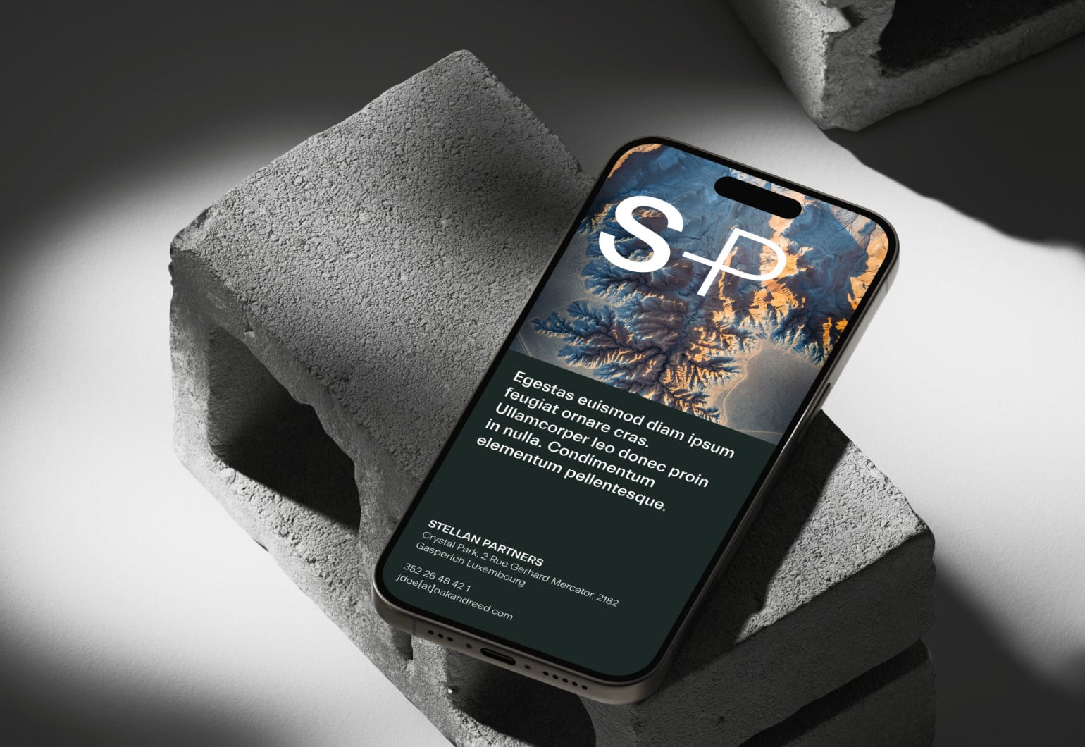
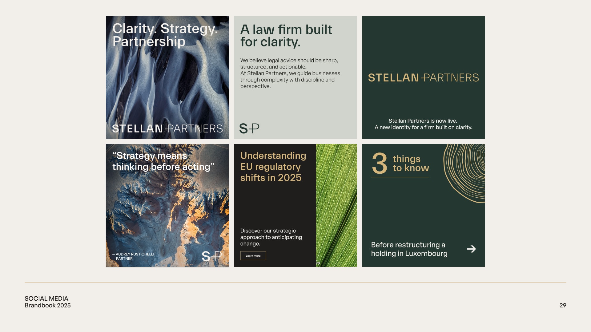
The visual system combines abstract aerial imagery and organic textures with refined, human-centered photography — evoking strategic depth, clarity and presence.
Deliverables
Brand strategy & storytelling
Logo design and variants
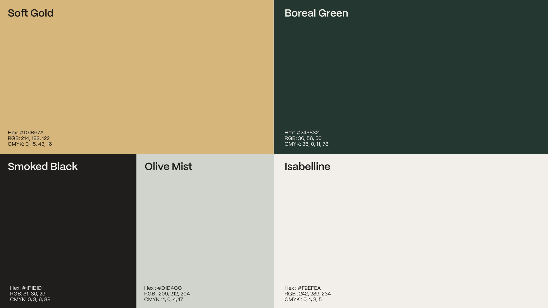
Complete brandbook (color, type, usage)
Print and digital mockups
Public Health Innovation